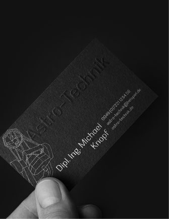
Astro-Technik
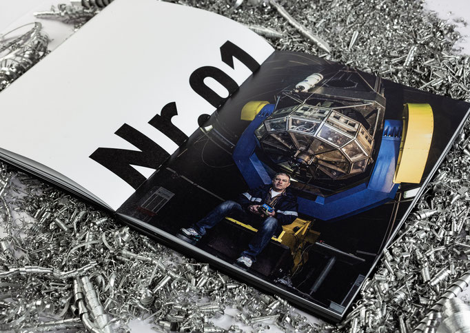
In the course of my pre-diploma in the class of Gerwin Schmidt at the Academy of Fine Arts Stuttgart, I accompanied the mechanical engineer and graduate engineer Michael Knopf for two semesters. As a self-employed person, he constructs telescopes and gives international scientists an insight into the darkness above us. In the course of this, a book, a script, a song with animated film and a poster were created.
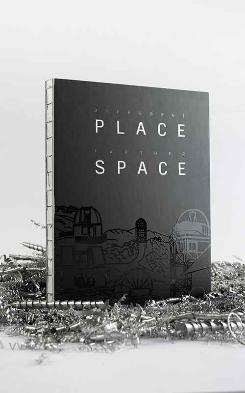
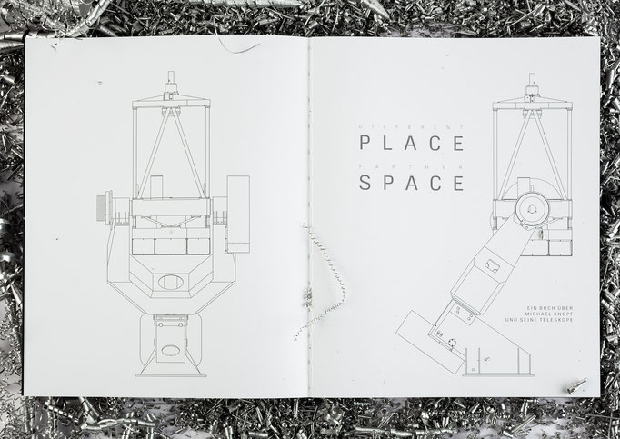
Book: Different Place Farther Space
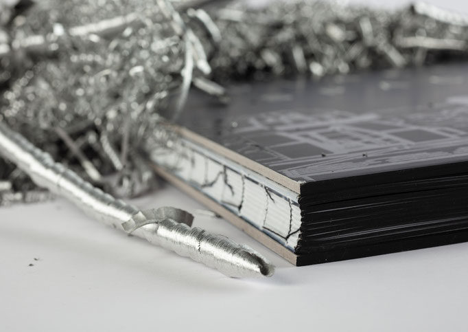
The book gives an insight into his career, some of his projects and the structure of his company. Reducing astronomy to its essentials, everything revolves around light and darkness, which is why the book is mostly black and white. The cover and colour binding are also black, and only the open thread binding gives a small glimmer of light in the medium. A spot varnish makes the title shine in the light and the illustrations on the front and back are clearly visible.


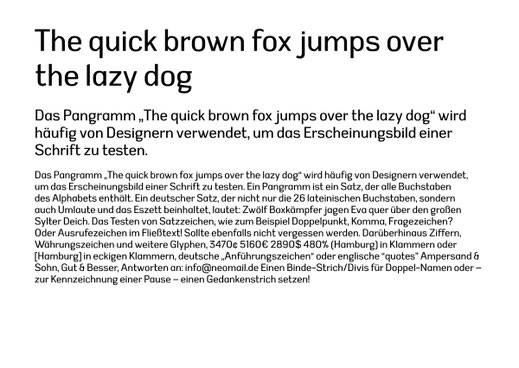
Font-Design: Astronomica
The concept behind the typeface Astronimica was to depict the different character traits and thus create an individual typeface. Through the combination of angular and round elements, the typeface unites characteristics such as precision, determination, but also composure and cosmopolitanism. The typeface works excellently in the field of technical family businesses.


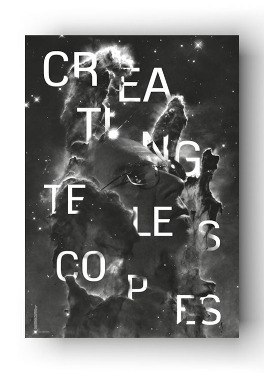
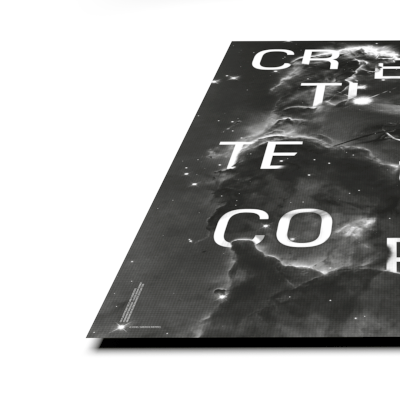
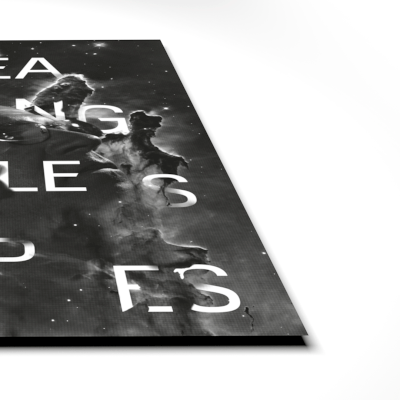
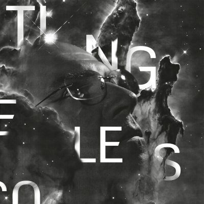
Poster: Creating Telescopes
The individual poster shows a photomontage of the engineer with a forward-looking view in the middle of the "Pillars of Creation". The typography "Astronomica" used on the poster was developed especially for this project.